诗有神奇的力量
把过去未来相连
把梦想现实渲染
用简练的文字描绘不朽的画卷
诗是感情的升华
是浓缩的语言阐释朦胧心中期盼
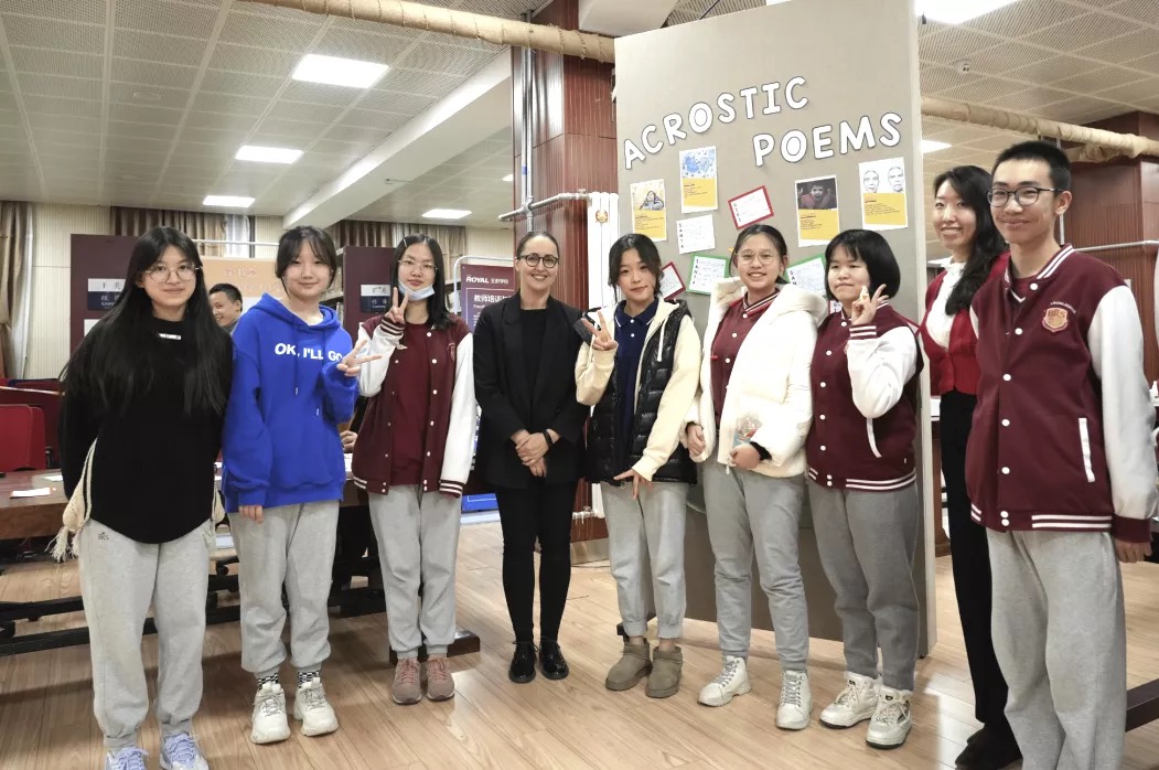
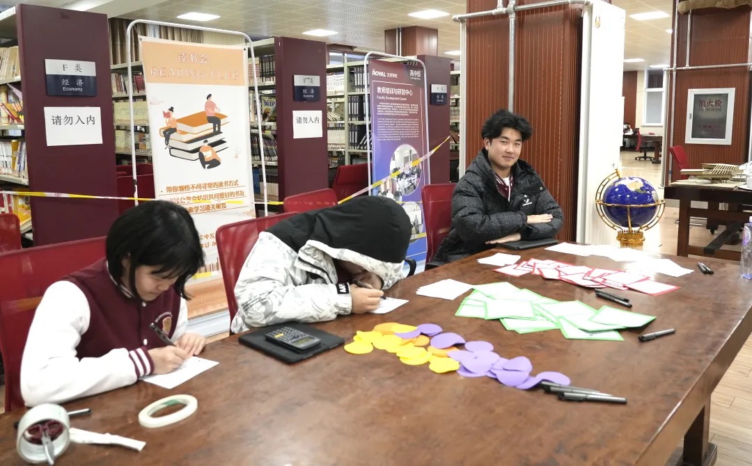
12月,北京王府学校英语ELL201课程与PreDP English B课程共四个班级的同学们通过诗歌单元的学习进入了英文文学世界,并根据所学知识设计成诗歌赏析海报在校区图书馆展览。
在整个单元中的学习中,同学们通过摘录简短的句子和段落掌握了许多不同的文学修辞手法:图像和声音修辞等。
ELL201 and PreDP English B were both introduced to literature through a poetry unit. Throughout the unit, students learned a number of different literary devices: both imagery and sound device. After mastering them through sentence and short extracts, they then applied their knowledge by identifying such devices in poems.
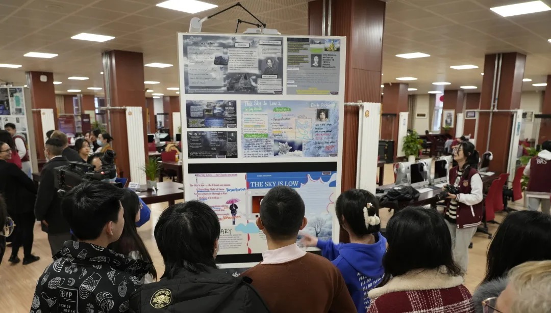
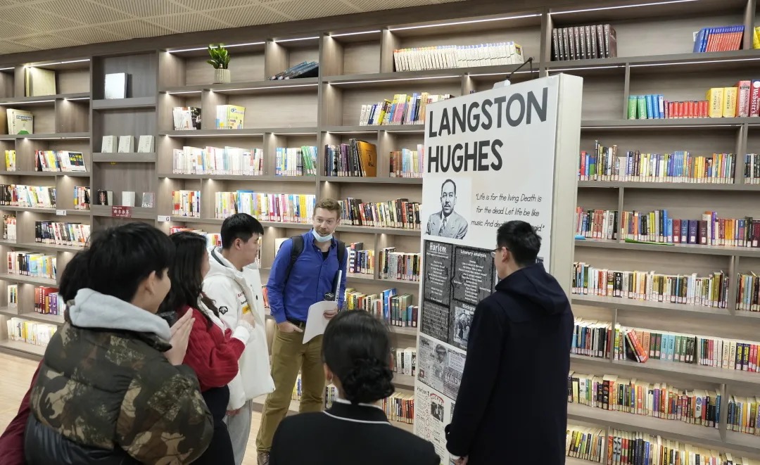
同学们通过了解诗人的人生经历、诗歌创作的时代背景,并利用辨别文学手法、探讨内涵意义去欣赏、研习了来自不同国家、不同年代的三位诗人的代表作品。
They learned about three renown poets such as the American Emily Dickinson and Langston Hughes and the British Stevie Smith. Together we explored two poems by each of the above-mentioned poets by identifying literary devices, discussing meaning as well as potential interpretations.
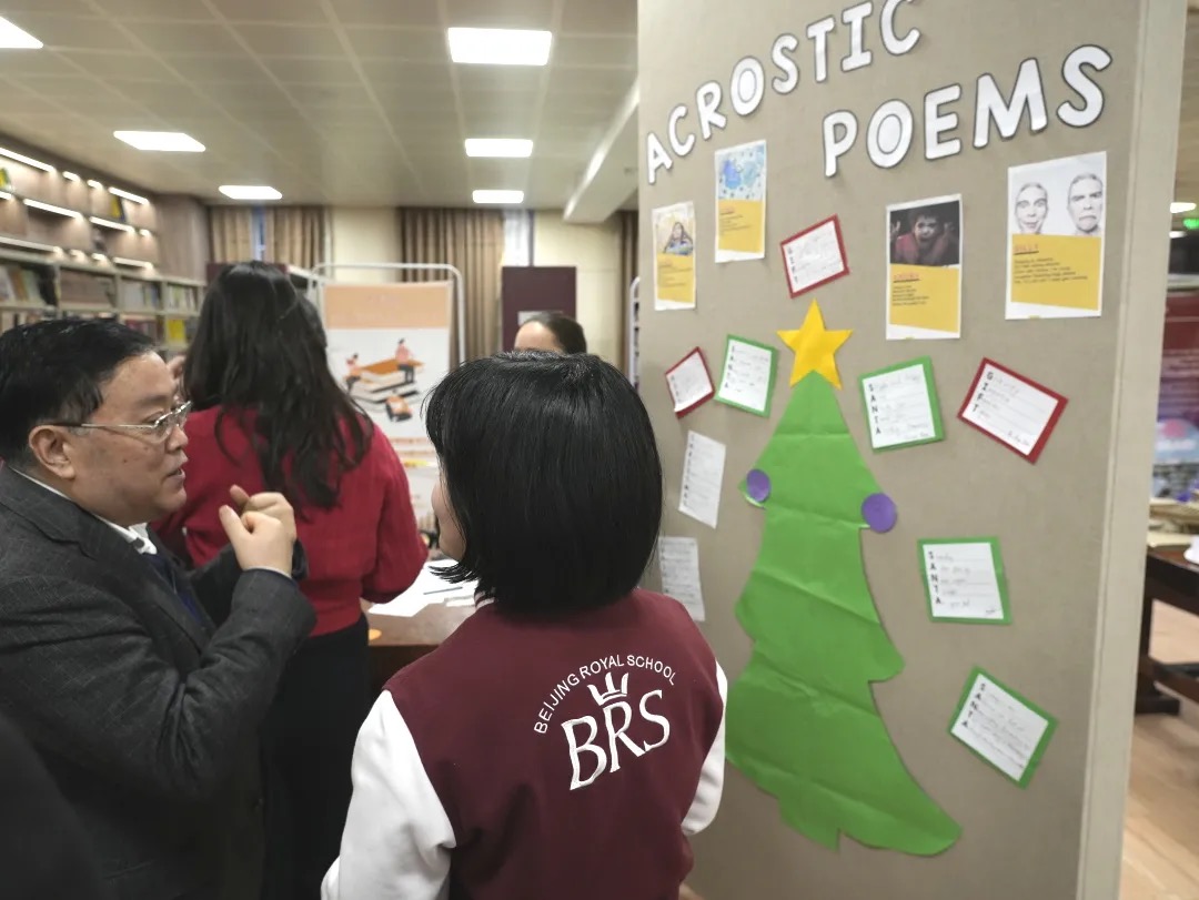
▲ 展览活动中同学准备了藏头诗互动墙,北京王府学校校长衡孝军参与互动并写下藏头诗“SANTA”(右图)
从19世纪的艾米莉·狄金森、20世纪中期的兰斯顿·休斯,到风格迥异的英国诗人史蒂维·史密斯,三位才华横溢的诗人带领同学们认识了英美诗歌文学发展以及时代的变革。
虽然很多同学是第一次尝试阅读诗歌,但他们在学习的过程中收获了意想不到的文学积累。
诗歌单元的学习以课题项目的形式结束。
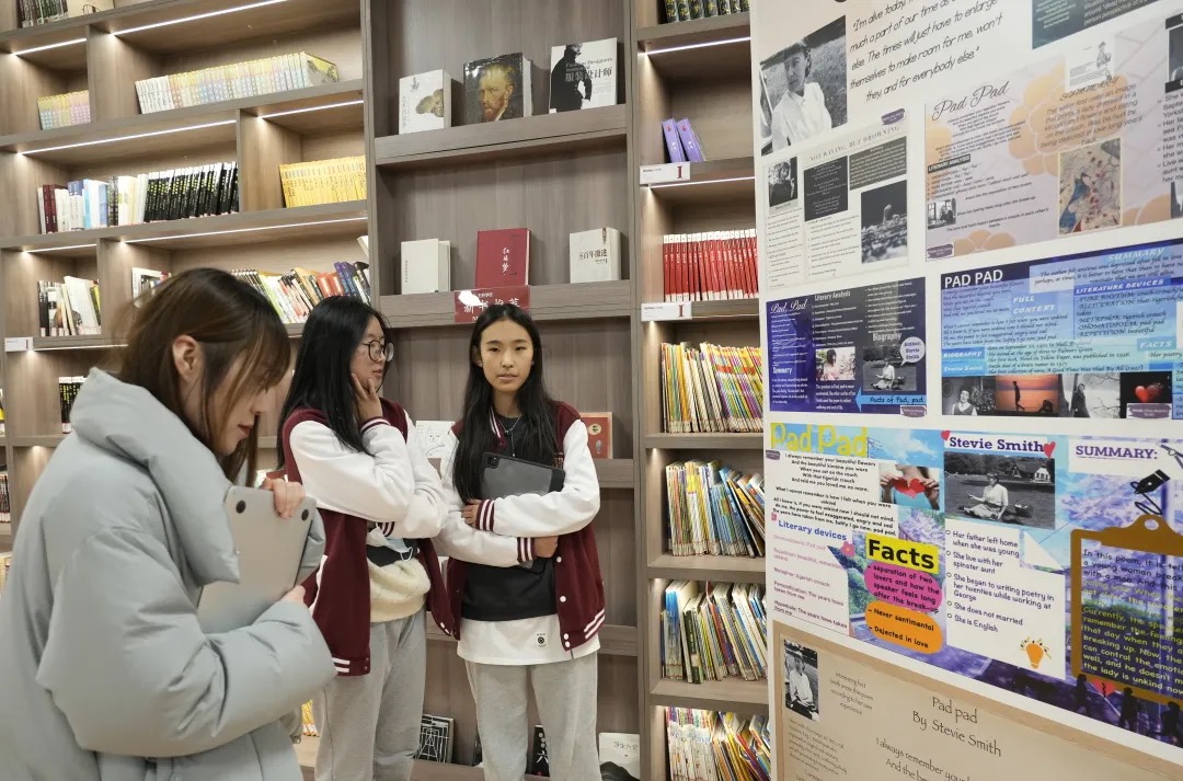
根据上述三位诗人的诗歌内容,同学们通过使用特定的颜色、图像、字体和其他文体等元素设计了海报,以此来诠释他们自己对某一首诗的深刻解读与思考。
完成海报设计后,同学们书写了简短的文章讲述了各自独特的设计思路。
The unit was concluded with the mid-term project which saw students designing posters to represent one poem, its meaning, its literary devices and the other by paying special attention to colors, images, fonts and other stylistic choices. They then were asked to write a short rationale essay to explain their choices.
部分优秀作品欣赏
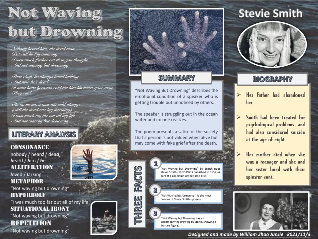
“ Not Waving but Drowning describes the emotional condition of a speaker who is getting trouble but unnoticed by others. The poem presents a satire of the society that a person is not valued when alive but may come with fake grief after the death. Thus, I choose pictures with the hand above the water surface to demonstrate the feeling of hopelessness, desperation, and indifference. ”(作品介绍节选)
老师评语:赵俊杰同学设计的海报几乎可以算是教科书式的标准作答。从图片、背景、字体、排版等方面各个细节的选择,可以看出学生的用心。特别可圈可点的是对于Not Waving but Drowning整首诗的概括和修辞分析。短短三句话准确地总结了这首诗的立意以及它一并传达的社会意义。此外,对于诗中六种修辞手法,赵俊杰同学能够精准分辨并进行分析解释,说明他在制作海报时是有独立思考和思辨的过程的。他写的论文整体结构清晰,重点突出,visualize、satire、fake grief等用词水准高于平均水平。总体来讲,不管是海报还是论文,都是非常优秀值得借鉴的作品。
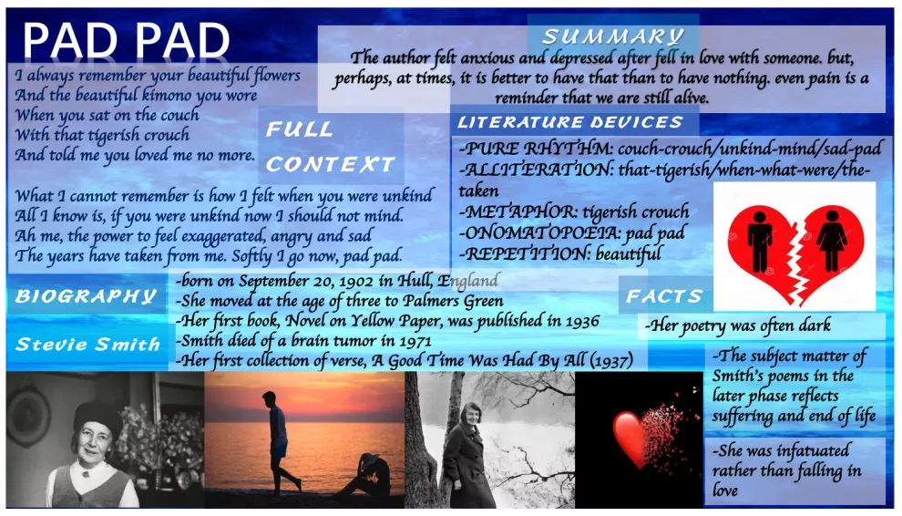
“ The poem that I analyzed is called, and it was written by Stevie Smith. In my poster, I use the color blue to be my background color. The reason why I choose this color is I think this poem is full of upset and distressed, which reminds me to think blue represents depression. So, I find a blue background image. Some of my pictures are Stevie Smith, and some pictures are ‘broken-hearts’, which sufficiently shows the emotion or state of this poem. The design of layout is according to the content of each parts and I want my poster to be full of words and pictures, which means there is no blank space on my poster. ” (作品介绍节选)
老师评语:周沐文同学设计的海报,第一眼看去,视觉上就非常吸引人,配色比较鲜亮,每个板块的布局紧凑又合理。在她选择每个颜色的背后其实是与这首诗Pad, Pad的主题紧密相关的。整首诗的语气和格调比较忧郁,夹杂着一丝遗憾,于是她选择了代表忧郁的蓝色做背景。诗的主题围绕年轻与成熟时期不同的爱情观,这也就解释了海报上出现的心形配图。对于修辞手法的分析,她也都一一准确分辨并解析,并加入了自己的理解。她的海报上几乎没有语法和用词错误,彰显了较高的英语语言功底。
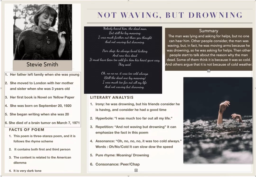
“ My poem is “Not waving, but drowning.” The author is Stevie Smith. The reason why I choose this photo of her is because I consider it is one of her most beautiful picture, and she was looking down for something, which can be correlated to the poem. The poem is about a man drowning in the river, and other people look at him. If people can image like this way, they may understand. I choose to use all picture in the dark colored, this is because I consider the whole poem is about irony. And the overall style is very classical, because I consider she spent much on London, this style can be corresponded to that city at that time. ” (作品介绍节选)
老师评语:潘璟玥同学的作品非常精致,米色、棕色和黑色的选择完美地契合了这首诗的些许黑暗但又具有讽刺意味的主题。她在介绍作者生平部分包含了六个方面,并选择了非常相关的事实来代表诗人。在她的总结中,她简要地解释了这首诗的内容。虽然有轻微的语法错误,但信息是明确的。潘璟玥的海报是一张精心制作的海报,因为她通过识别六种文学手法并为每一种都提供了正确的例子,做了非常详细的文学分析。两张图片是对海报的补充,分别在左上角向我们展示了诗人,在右下角向我们展示了这首诗的标题和内容。
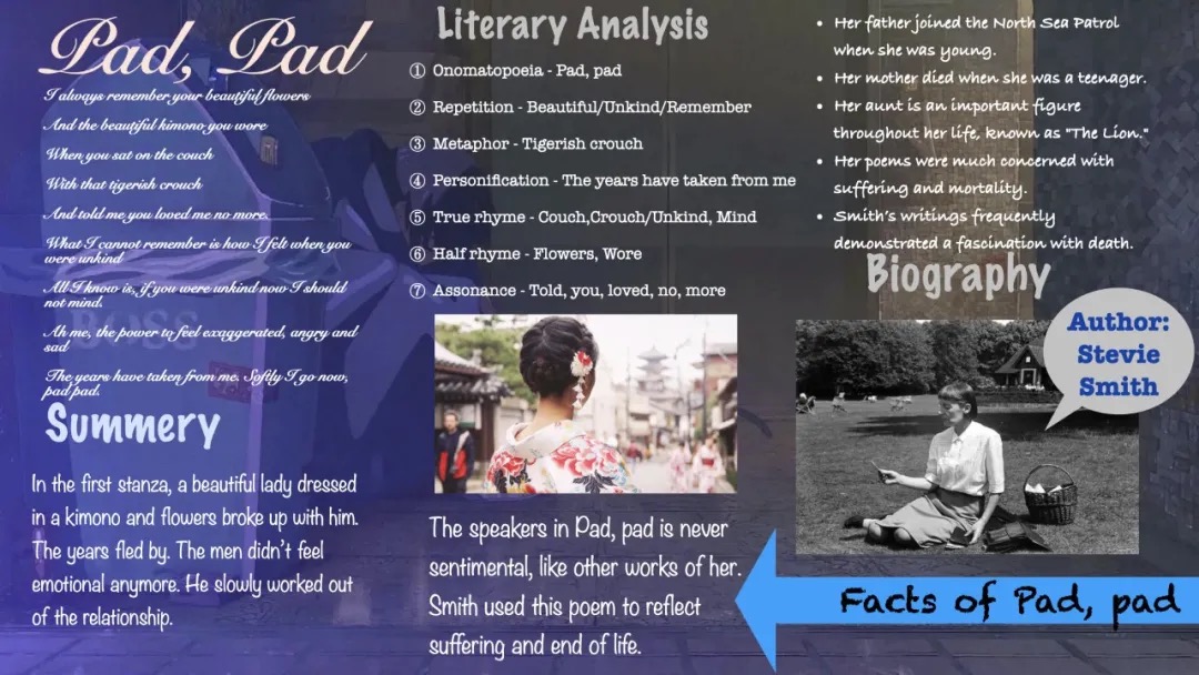
“ Pad, pad is a poetry about love and memory, which was written by Stevie Smith. According to the content, the readers can realise that this was not a pretty love thoroughly because the beautiful female told him that she loved him no more. So I used the deep blue background to express the depression of broken-hearted love. Blue is a typical cool color, which can make people feel cold. Also, I choosed the Snell Roundhand for the font of poetry. Cursive English looks classical and romantic, which can show the main tones of this poem. In the plate of Literary Analysis, I used modern font to improve the clarify. ” (作品介绍节选)
老师评语:薛琬蓉同学为她的诗海报选择了蓝色色调,因为这首诗充满了忧郁,内容表达了一个男人回忆起分手及其对他的影响。中间的画面是一个很切题的选择,因为它指的是与诗中的主人公分手但没有露脸的女人所穿的和服,因此就像诗中的女人一样神秘。海报的流程和结构非常清晰,带有副标题,可以引导读者进行探索。传记信息写得很好,薛琬蓉选择在其中记录诗人一生中最悲伤的事件。她的文学分析也非常准确,因为她能够运用上课所学知识去识别了七种文学手法并为每一种都提供示例。
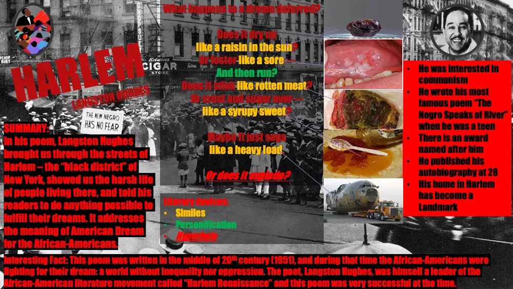
老师评语:“Harlem”是一首强有力的诗,赵于果同学在阐释其强有力的信息方面做得很好。他决定选择黑色和红色等强烈的颜色来更好地表达信息。虽然可以通过减少红色的数量来进行一些改进,但总的来说它是一张叙事有力的海报。他的总结写得很好,并且对这首诗的主题进行了恰当的解释。他的作品很少有错误。此外,他在作者介绍中加入了非常连贯且重要的事实,更好地帮助观众去了解作者和这首诗背后的背景以及有关这首诗的其他事实。文学分析是通过使用不同的颜色去代表了三种修辞手法来完成的。此外,他还添加了一些图像来帮助读者理解复杂的词汇。
这次的海报设计课题不仅激发了同学们对学术研究的热情,在积极努力地设计过程中也发掘了他们的艺术天赋,并以此鼓励着自己去发展更多的技能。
Overall, the experience resulted in positive effort and engagement. Students loved developing their design skills and were pushed to further their research and summarizing skills.